At some point in this sort of voluntary, part-time work, you have to face the fact that people can produce misinformation, honest misunderstandings, and conspiracy theories far more rapidly than you can write about them, and that it is literally, physically impossible to keep up. For me, this realization came around the first week of April. At times like that I am thankful for people like Dr. Mikhail Varshavski (“Dr. Mike”) and Dr. Zubin Damania (“ZDoggMD”) who are doing this work consistently on Youtube and their own websites, and for people like Dr. Emily Smith, Your Friendly Neighborhood Epidemiologist, and the anonymous Your Local Epidemiologist, who for all I know might also be Dr. Emily Smith (I’m just saying, have you ever seen them together in the same room at the same time? Probably not. Because quarantine). If you have a question about a piece of misinformation or something that’s unclear about COVID-19 that I haven’t addressed on this blog, or (as seems more likely) that I’ve addressed in such a wordy and convoluted way that you are actually worse off than you were before my ‘explanation’, chances are one of these folks has got your back. There must be many people out there doing this type work that I am missing; please feel free to link to their sites in the comments.
With so many pieces of misinformation floating around out there and so little time to write 3,000-5,000 word blog posts, today’s post is just an attempt to debulk the malignant tumor of COVID-19 misinformation. The rules are simple:
- Memes only.
- Each meme gets one paragraph only (paragraph length unspecified)(and it still counts as one paragraph if it is interrupted by pictures or videos).
- The crazier or less sincere the meme, the snarkier the response.
COVID-19 Medical Information.

We’ll start out with a light one. I’ve seen this posted with the comment “Coronavirus is a cold.” It’s hard to derive any sort of conclusions from just that. Does the meme intend to convey that the entire worldwide pandemic is a hoax? Are they are trying to say that literally all of the deaths and suffering have somehow been fabricated? If I posted this meme with the comment “wow, look how much we’ve learned about Coronaviruses in the last 3 decades,” it would completely change the meaning; but the meme as written is clearly designed to imply that the pandemic has been faked because coronaviruses only cause colds. I think there’s at least three legitimate ways we could debunk this idea, and I can’t really decide between them, so we’ll do all three. First, we could do some basic education on medical history. ARDS, Acute Respiratory Distress Syndrome, was first described in 1967, just one year before Coronaviruses were classified; but the first Coronavirus that was known to cause ARDS was SARS in 2003. Obviously it wouldn’t have been known in 1989 that Coronaviruses would emerge that caused such severe respiratory complications, and thinking of them as a virus that typically only causes a common cold was perfectly reasonable. If you want a thorough explanation of the history of coronaviruses and ARDS, I recommend this article, which could have been written as debunking of this meme: A Brief History of Human Coronaviruses by Shawna Williams. It contains an excellent visual timeline, which I’ve included only a fragment of here.

The second approach I think is valid is to point out how silly it would be to fake a pandemic using a virus that is known to cause only a common cold. It seems like faking infections, hospitalizations, chronic complications, and deaths in every single country in the world and having doctors, nurses, respiratory therapists, researchers, and millions of non-medical people pretending to be patients, would take an awful lot of effort; maybe it would have been worth devoting some of that untold energy and seemingly infinite resources to attributing your fake pandemic to a pathogen that couldn’t be disproved by by pulling up any old text book from before 2003. This is what makes me think that the meme was knowingly deceptive on the part of the original creator, because it’s so hard to believe that somebody actually found this in a 30 year old text book and said to themselves “aha! got ’em!” The third and final point we could make is to just point back at the meme itself, just eight lines up:

This textbook page doesn’t list cervical cancer as a disease linked to the Papovaviruses family, which under the classification scheme used at that time included human papillomavirus; HPV. Maybe it’s a good thing that medical knowledge and research has continued to progress since 1989?
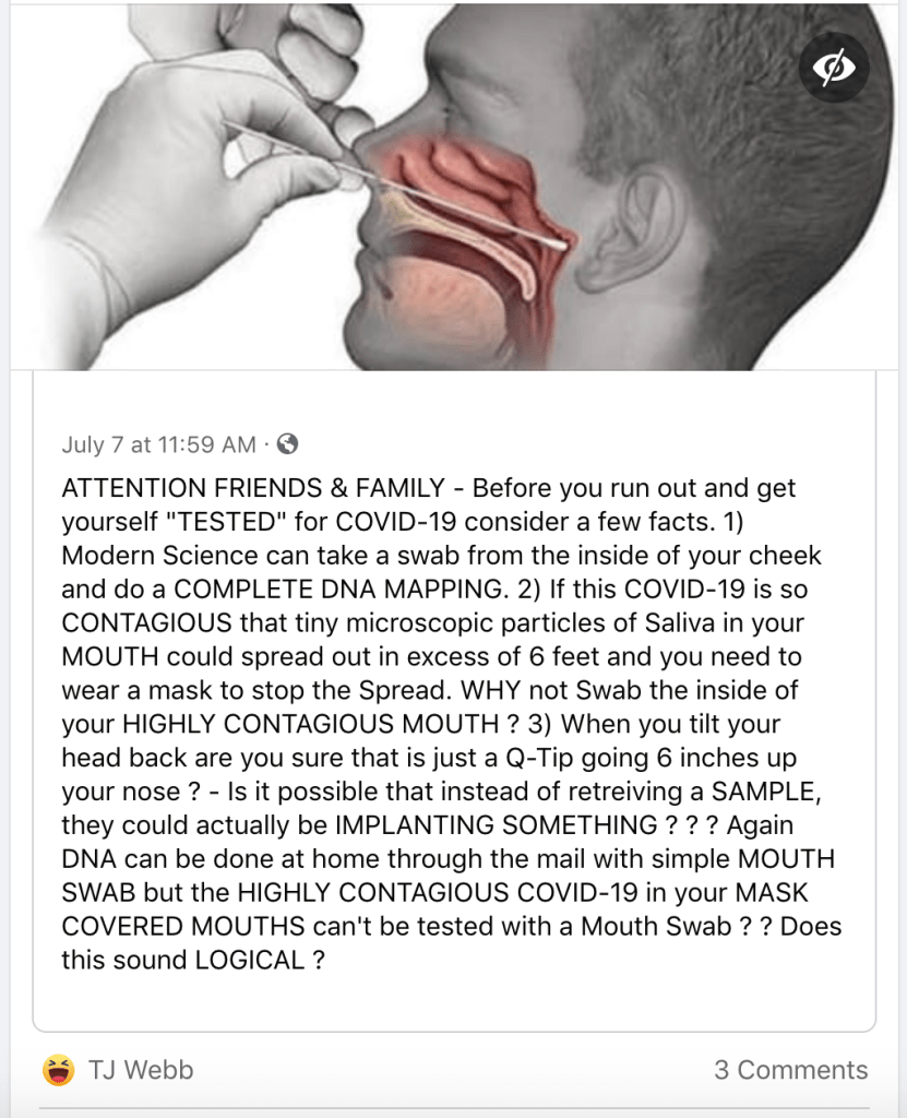
This is one of my favorites, and was actually shared to my Facebook wall by my mom (I should clarify; she shared it because she also thought it was ridiculous and knew I would enjoy it). Something like this almost has to be written facetiously, right? But for the sake of thoroughness, let’s clarify a few points here. First of all, the reason the collection is done in the nasopharynx really isn’t that complicated; that’s where the virus is more densely populated, compared to other locations that could be swabbed, and going deeper in increases the chances of picking up the virus on the swab. I know it’s uncomfortable; I’ve had it done three times now, and the second time was especially awful. Despite what people may think, doctors and nurses don’t like causing pain, and we wouldn’t use it if we felt like there were other reliable options. But so far studies comparing the sensitivity and specificity of Nasopharyngeal swabbing to other swab techniques and locations have been mixed in terms of how determining how necessary the Nasopharyngeal swab actually is. Some have shown that it clearly gives us the most reliable way to tell if you have the virus or not, and others have shown that other swab locations might be just as good. But until something like a definitive answer emerges, doesn’t it make sense for your doctor’s office to use the technique that everyone agrees is as accurate as possible? This is all pretty obvious, but doesn’t answer the question of ‘if the virus is so contagious, why wouldn’t a less invasive test work?’ The other part of this meme seems to call into question that the virus is contagious if we have to do such an uncomfortable test to detect it, and the answer here is simple too; when we test for the virus, unlike when you get infected with the virus, we don’t have the virus’s help. You see, your body is a good breeding ground for certain viruses, who use your own cellular machinery to reproduce and, when they reach a certain point (viral load), begin to cause disease. This takes time; the incubation period (how long it takes the virus to reproduce enough to cause illness) of COVID-19 is 2 to 14 days; the COVID-19 test we use in our clinic comes back in 15 minutes. That’s because the tests we use aren’t trying to let the virus go through multiple reproduction cycles until it has proliferated enough to be detected; this is a good way of testing for pathogens called a culture, but it takes longer. The rapid tests rely on detecting some part of the virus, such as its DNA or specific proteins, and the more of the virus that is collected for the test, the more likely it is for the test to be accurate. In other words, the test may require more of the virus to be reliably accurate than the virus requires of itself to make you sick. Finally, the part about the microchip is really, really silly, and if you believe it there probably isn’t much I could say to change your mind; but if it helps here are two videos; the first showing exactly what our swabs look like, and the second showing me getting the Nasopharyngeal swab done at one of our clinics.
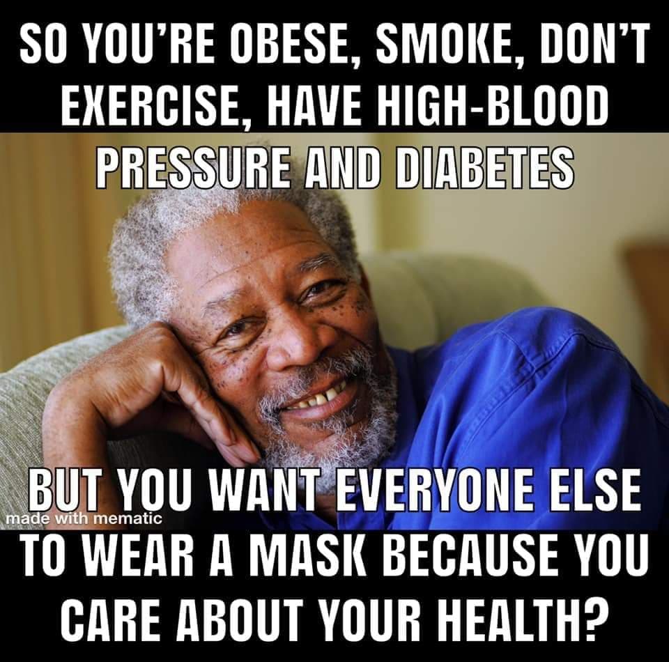
Two signs that your meme is bad:
- Your main point can be summed up as, “people with certain medical conditions deserve to die.”
- You add a picture of Morgan Freeman and I still don’t read it in his voice.
There’s not much to do with this one. Sometimes high blood pressure, diabetes, and obesity are significantly attributable to personal decisions, and sometimes not. It’s always, and I mean always, much more complicated than people know from the outside, and managing these conditions both as a doctor and as a patient is hard, frustrating, and often feels like an uphill battle. Sometimes people can exercise, and sometimes they can’t. Yes, smoking is bad for you, and I spend a lot of time trying to help people quit (by the way, one of the most effective and least utilized methods for quitting is getting a smoking cessation coach. You can get one for free at https://www.yesquit.org, and they can even help set you up with free nicotine patches or other medications), and you should quit, but we know it isn’t easy. The idea that anybody should be shamed or punished for a medical condition, let-alone medical conditions that are only partly modifiable with behavioral changes, is obscene. Shame on you to whoever made this meme and to anyone who shared it, and on Morgan Freeman for endorsing it.
Before I get angry e-mails, that last part was a joke; I realize that Morgan Freeman has no idea this meme exists. But isn’t there something disturbing about both this and the next meme exploiting the images of Black men- one for his gravitas, acting talent and air of wisdom, and the other for his strength, hard work and physical prowess- to minimize a pandemic that is disproportionately killing Black and minority men and women?
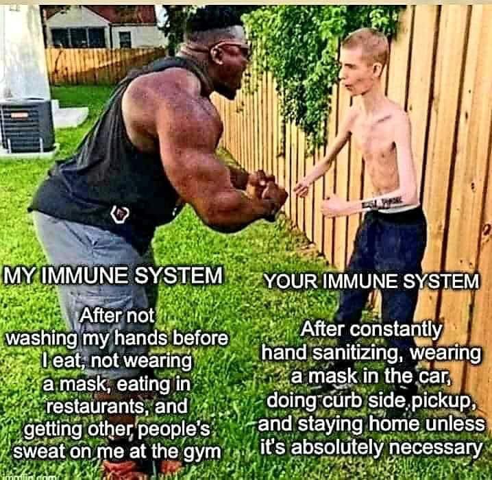
I’m going to just admit now, figuring out the origin of this picture took me longer to research than almost any medical question I’ve addressed on the blog so far. At first glance I had no idea what was going on here, but I braved the internet so that you don’t have to, and here’s what I came up with. According to my research, the image depicts champion body builder Blessing Awodibu, known both for his multiple body building titles and his various comedic Youtube videos, flexing next to “Daddy Long Neck”, a social media personality and musician who has Marfan Syndrome, a connective tissue disease. The two did a sketch together on Youtube back in December of 2018 where they arm wrestle, and this image appears to have been taken at the same time. We’ve already addressed this idea that by taking precautions to avoid COVID-19 you are somehow coddling you immune system into a state of weakness back when we compared your immune system to a Death Star, and on a few other occasions early on in the blog, so I won’t rehash it here. Suffice to say that while exercising is of course a healthy habit, none of the things listed by Awodibu are going to protect someone from COVID-19, and I’m fairly grossed out by the fact that whoever made this doesn’t wash their hands before eating.

There’s also a good bit of irony here, since in the original Youtube sketch Daddy Long Neck actually won the arm-wrestling match, prompting Blessing Awodibu to ask “which protein do you use?” This would imply that the immune system in the meme that is wearing a mask, using hand sanitizer, and doing curbside pickup for groceries is less likely to get sick from COVID-19, so I guess I do agree with this meme after all.
COVID-19 Statistics (Yay!)

I’ve included a few statistics memes that were sent to me recently, and this first one is the most straightforward of the bunch. Unlike the others, which make a few important intentional or accidental statistics errors, this one is clearly written by someone who has no grasp of statistics at all. Let’s look at the three statistics it gives:
- 0.94% of Americans have contracted the virus.
This is actually a really terrifying statistic, because if it were true, it would mean that the now 143,000 deaths (up over 10,000 since this meme was made last week) are just the tip of the iceberg; that we’ve had that many people die and over 99% of the population hasn’t even had the virus yet. Fortunately, this meme is only accounting for confirmed cases, and does not take into account any of the antibody testing and studies that have helped us get a better estimate of the number of asymptomatic and minimally symptomatic people who have already been infected with SARS-CoV-2 without realizing it. Even in areas that have already survived a surge of cases, these numbers have not been anywhere near high enough to confer herd immunity, and we definitely aren’t out of the woods yet; but if only 0.06% of people have even had COVID-19 at this point, we would be on track to blow even the most dire models from March or April completely out of the water. - The survival rate is 95.72%.
We talked about this a lot back in the posts about the Dr. Erickson/Bakersfield Urgent Care Doctors video. The easiest way to make a really alarming statistic seem mild is to just present the inverse. A “95.72% survival rate” sounds like a good thing, because survival is good and 95% is a ‘high’ number; “see, the good thing has a high number! It’s not that bad!” But this is exactly the same as saying that COVID-19 has a mortality rate of 4.3%, instead of the still scary but much less catastrophic 0.5% to 1.3% most doctors I know would be willing to accept. A mortality rate of 4.3% is terrifying for a virus that is this contagious, and flipping it to “95.7 survival” makes it exactly 0% better.
So the first two statistics by themselves actually constitute a form of misinformation about the virus we’ve seen only rarely, in that it makes this already terrible pandemic seem even more dangerous than it actually is. Which is what makes the final statistic so baffling. - Only 0.04% of Americans have died, so the survival rate is 99.96%.
This is why you don’t make memes as a group project; it’s obvious that the person who wrote the last part hadn’t looked at the rest of the presentation, since the line immediately before this claimed a survival rate of 95.72%. What they’ve done here is divided the number of deaths by the entire population whether they’ve had the virus or not, very similar to what Dr. Erickson did in his video when looking at deaths early in the pandemic (“millions of cases, very little death”). But that’s not what a “survival rate” is at all, because you are basically making the claim that hundreds of millions of people have ‘survived’ something they haven’t been exposed to yet. I can think of exactly one type of scenario where it would be helpful to calculate a “survival rate” based on the entire population instead of just the people actually effected (i.e. the people who have survived), and that would be after an extreme mass casualty event. For example, in the 1997 movie The Lost World: Jurassic Park, a T-Rex makes it from Isla Sorna to San Diego to rescue his baby by… Swimming? Stowing away on a boat? That movie was so crazy I can’t remember. He weaves a path of destruction across the city until… something happens to stop him, I think. Anyway, in a situation like that, it would be reasonable to calculate a survival rate for the entire city once the dust settles; but using the current number of deaths compared to the US population to calculate what percentage of Americans have “survived” COVID-19 right now is like calculating the T-Rex survival rate for San Diego while it’s still running behind you on Harbor Drive.


I like this meme for three reasons: 1. It starts and ends reasonably, 2. It comes from my home state, and 3. It is the best statistics example I’ve seen yet of comparing apples to oranges, only in this case somebody has painted an orange red and glued a stem to the top to try to pass it off as an apple. Let’s break it down a bit:
“Here are some numbers that are confusing to me.”
This is a great start, and honestly if all misinformation could start out this way instead of “READ THIS BEFORE FACEBOOK DELETES IT” we would be a lot better off.
Covid-19: 3,399 deaths/88,691 cases = 4% of the people with cases have died.“
This is actually a great way to phrase this, because it emphasizes a few points that we can’t be too precise about. Louisiana has had 88,691 confirmed cases (now 95,002), but we can’t be sure how many people have had the virus without getting sick and getting tested, so saying that 3,399 of the people with confirmed cases have died, to get a case fatality rate of 4% is precisely correct. It also uses the present perfect tense instead of the past tense, a nod of recognition that this pandemic is not over. For people in Louisiana with confirmed cases of COVID-19, 4% have died up to this point; many are still fighting for their lives, many are recovering, and many more are being diagnosed as we speak; this number is dynamic.
Flu: 1,400 deaths/14,000 cases = 10% of the people with cases died.
Notice the past tense? Because the 2018-2019 flu season is over now? Masterful. But unfortunately, here’s where it all goes off the rails, because Louisiana did not have 14,000 cases of flu last year; it had 14,000 hospitalizations for flu. And that completely changes the meaning of the statistic, because now you are comparing the very sickest flu patients with the most dangerous risk factors to all confirmed COVID-19 cases and getting a number on the same order of magnitude. That makes COVID-19 insanely scary. And we don’t yet know how many hospitalizations for COVID-19 this pandemic is going to have, or how many deaths, because we are still in the middle of the pandemic. We’ve talked about the problems inherent in comparing flu and COVID-19 before, and we’ll cover some of them again below; but if we want to compare something at least in the same fruit family, there are studies that have looked at the number of deaths compared to hospitalizations in Louisiana hospitals from COVID-19, just as this meme does for the flu. One study from the New England Journal of Medicine, which also looks at the increased burden of COVID-19 on African Americans due to chronic health disparities, found a hospital death rate of 24%, compared to the 10% for the flu in the meme above.
So, I don’t understand why we haven’t been wearing masks already?
This meme is so precise in every other respect, and the mistake between 2017-2018 flu cases and flu hospitalizations is so glaring, that I can’t help but believe it was intentional. I find that really disappointing, because otherwise I really like this one, and I definitely agree with the final point. Why haven’t we been wearing masks before now? 15,000 to 60,000 deaths from flu each season may not be COVID-19 pandemic levels, but it still represents a lot of human pain, suffering, and grief, and wearing masks during flu season would cut down flu transmission a lot. Here’s hoping that our experience with COVID-19 will teach us some useful transmission control skills as a society going forward, just as SARS did for Taiwan in 2003.
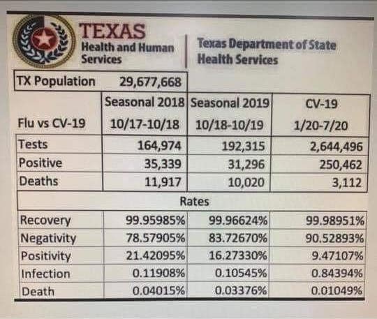
We can move due West to my new home state, Texas, to see another meme explaining to us, contrary to what every doctor and epidemiologist has been saying for months, why COVID-19 just isn’t very dangerous compared to the flu. In a perfect world, it would be enough to explain that this is a fake, and move on with our lives. This is not a table published or endorsed by the Texas Department of Health and Human Services. There are a few ways to tell. First, it looks fake.

And second, DSHS said it wasn’t from them.
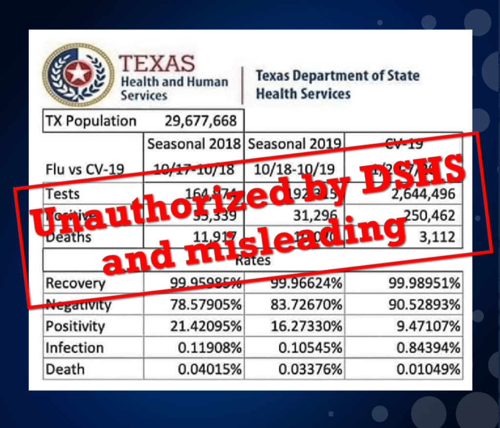
And really, do we need to say anything else about it? If the meme is a lie in the first place, do we need to spend the energy picking through the data? I will never understand the mentality that says, “sure, it was a lie, but I still think it makes some good points!” When you have discovered that something (or someone) is not a truth telling thing, stop going to it for truth.
But let’s look at the numbers, briefly.
Texas Population
Yep.
Seasonal Flu Numbers 2017-2018, 2018-2019
These all check out too, and you can find them here (2017-2018) and here (2018-2019).
Flu Rates, 2017-2018, 2018-2019
We can ignore the negativity and positivity rates, because they really don’t matter for this discussion. The rest of these took me a minute, because I’ve never seen these numbers before, and they didn’t really make sense. You see, the commonly accepted case fatality rate of the flu is 0.1%, and I couldn’t figure out either how or why a meme trying to show that the flu was more dangerous than COVID-19 would cut the death rate of flu by more than half. It took a few minutes (honestly, as many times as I’ve seen this dumb trick played since I started this blog, I’m embarrassed it took that long), but then it hit me; they are dividing the numbers from the top the rows by the population of Texas to get the numbers in the bottom 5 rows. It’s the same nonsensical math they did in the first stats meme we look at in this blog post! Look at the “Seasonal 2018”:
- They calculate the “infection rate” by dividing the number of positive tests by the population of Texas. 35,339/29,677,668×100=0.11908%. The problem is, that isn’t the number of flu cases, it’s just the number of positive flu tests. I saw scores of flu patients in both of these years, in the state of Texas, but most of them aren’t represented by this data because most didn’t get a flu test. Why? Because it’s primarily a clinical diagnosis and the flu test has a sensitivity of 50-70%. Unless it’s a clinical scenario where having a specific test result is going to change the patient’s treatment, the flu test isn’t useful to me. I often offer it to people who ‘just want to know’, but if they have flu-like symptoms and flu exposure in the middle of flu season, I’ll explain that ‘if this flu test is negative, I’m not going to believe it because you definitely have the flu.’ So that infection rate is an extremely inaccurate, way too low estimate of how many Texas had the flu during the 2017-2018 flu season. Why does that matter? It doesn’t really, for this discussion, except as a hint at the fuzzy math strategy they are going to take with the more vital numbers.
- They calculate the “death rate” by diving the number of deaths by the population of Texas. 11,917/29,677,668×100=.04015%. Again, that’s not anything. You could compare the death impact of flu to other diseases by comparing the deaths per 100,000 people, or you could compare the case fatality rate by dividing the deaths by the total number of cases; but just diving the number of deaths by the total population conflates these two important numbers and gives us nothing useful at all. But it gets worse.
- They calculate the “recovery rate” by subtracting the number of deaths from the population and then dividing by the population. (29,677,668-11,917)/29,677,668 x100=99.95985%. So by their own math they are saying that 29,665,751 people in Texas recovered from the flu, including 29,642,329 people that never had it. This is by far the strangest use of the word “recovery” I’ve ever heard. Please, tell a friend that you’ve recovered from measles and when they ask, “when did you have measles?” tell them, “I didn’t; that’s why I said I’ve recovered from it. Duh.” See if you don’t get punched.
So what do they do with the COVID-19 data? Well, pretty much all the same nonsense; claim that tens of millions of people have ‘recovered’ from COVID-19 who haven’t even had it yet, divide the deaths by population instead of by confirmed cases to get a “death rate” of 3,112/29,677,668×100=0.01049% instead of 3,112/250,462×100=1.3%, and produce an infection rate that is utterly meaningless. But the two worse misinformation sins are these: first, they have gravely misunderstood the differences in our testing strategies for flu and COVID-19. In flu we test the sickest patients or the patients for whom a certain test results really guides our clinical judgement, which means we test a relative few of our actual flu patients. In COVID-19, we are testing many patients including people we don’t think have the virus because it is important for contact tracing and other epidemiology measures (and of course because we want to implant as many of those microchips as possible). This means that positive tests vs. deaths is not a useful statistic unless you really understand the testing strategy, because the COVID-19 strategy is going to catch a far higher percentage of the mildly symptomatic COVID-19 cases than we ever would for flu. But the point of this meme, I honestly believe, is to draw your eyes to the four cells right here, to try to trick you into thinking that COVID-19 is orders of magnitude less dangerous than the flu, which couldn’t be further from the truth.

But the second misinformation sin is also the most important, practically speaking, and it’s this; that they made this meme in the middle of the pandemic, and COVID-19 is still killing Texans. Since this meme appeared a week ago, we’ve gone from 250k cases to 332k, and from 3,112 deaths to 4,111. 1,000 lives in less than 10 days. The meme calls flu season a whole year (“10/17-10/18”) and tries to stretch the COVID-19 pandemic in Texas to as long as possible to make them seem comparable; “1/20-7/20”. But in January and February we had zero deaths. By the end of March we had 42, and by the end of April, 782. This has been a Summer pandemic for Texas, and the people who will increase that total by next week are fighting for their lives today. In real life, in a hospital; not on a spreadsheet. I don’t know if COVID-19 will cause more than 10,000 deaths in Texas. I hope it won’t, but it probably will; I can’t see a way around it. The people who are sharing this meme have apparently already determined, right now, that those deaths will not impact their beliefs about this pandemic. Those lives won’t count. Whether it’s because they are nameless and faceless to them, or because they were ‘faked’ by the doctors, or because they heard that somebody who was in a car accident ‘got counted as a COVID death’, they’ve decided that no matter how many human lives are lost in our state, country, or world, it can all be waved away as long as you can find some way to arrange the numbers that makes those lives seem insignificant. Until it affects them personally, which is the very thing the rest of us are all working so hard to keep it from doing.
Political Stuff (Boo!)

I don’t know about international politics, and it’s too late to look it up, but I’m assuming this is wrong; surely somebody somewhere is trying to unseat a president this year. So, ha, got you on a technicality. I wrote last week about the idea that COVID-19 was a big conspiracy to somehow hurt the president, and how that depended not only on not having any knowledge about the pandemic, but also on not knowing much about doctors, because of whom I’ve been subjected to more doctor’s lounge Fox News broadcasts in the last decade than I ever wanted to watch in my lifetime. That’s about as political as I get on this blog, except to say this; dispelling this meme, and the beliefs behind it, should not be my job. It’s the job of our national leaders, and especially the presidential administration, to challenge these lies that are so incredibly dangerous to Americans, instead of tacitly endorsing and even actively promoting them. Every time they refuse, people die as the result.

I have never seen a patient so hypoxic
They start out with a cough but by day 10 they’re looking toxic.
Our leaders tweet “the doctors are faking this virus”
We shoot back, “stop supporting these lies your job is to inspire us”
Social media’s nothing but conspiracies, politics,
They won’t listen to truth and reason, so everyday more get sick.


Thanks fella! As always, really good, balanced info in a self-deprecating, fairly easily digested format. And snarky enough to be funny when it’s appropriate! Blessing to you and your beautiful family!
LikeLike