
A physician friend recently brought to my attention the First Trust COVID-19 Tracker, a weekly 1-page document released by First Trust, a Wheaton Illinois based blog on *checks notes*… Financial Advising? Ok, that’s fine; COVID-19 has affected everyone in profound ways, and if a financial blog wants to use its resources and time to share important information about COVID more power to them.
The fact that my friend lives in Texas and is being confronted with this information on a weekly basis does raise concern, however, specifically on the questions of source authority and nitpicking data and sources. Throughout the pandemic we have seen people spread misinformation from non-medical, non-scientific sources far removed from their actual location for the simple reason that they had to look far and wide for data that seemed to support position when the data for their own hometown did not. We saw this on a large scale with the Massachusetts Outbreak in August, which people all over the country pointed towards as proof that the vaccines were ineffective, at the same time that they wouldn’t be able to get an ICU bed in their own city because of the surge of unvaccinated hospitalizations for COVID. There may well be a perfectly legitimate reason that this individual in Waco Texas uses First Trust as their go-to source of COVID-19 information. Many blogs have followers from all over the world (or so I have been told); maybe they have followed the First Trust blog for years and it was already a resource they trusted prior to the pandemic, or maybe they like the attractive layout and graphics. But when someone ignores their local county health department’s COVID-19 dashboard in favor of a weekly COVID tracker from over a thousand miles away (trust me; I drove all 1,000 of those miles a few weeks ago), we do have to stop and ask, “Why? Why look so far away?”
There are some things I definitely like about the First Trust COVID-19 Tracker. First, it really is a lovely document; the layout and graphics are eye catching and superb; if I were creating COVID-19 statistics handouts for social media I would want them to look just like this. More substantially, there is nothing overtly partisan about the presentation. We will exam the way that First Trust has selected and chosen to present their data, which is either intentionally or unintentionally misleading at times; but it is data, not conspiracy theories or outrageous lies, and they even include some of the data that weakens their evident position. In that sense it is sort of a breath of fresh air. My overall impression of the First Trust COVID-19 Tracker is ‘bias but honest’, and it’s hard to say how much of the misrepresentation of the information is deliberate vs. accidental; I personally believe it’s mostly the latter.
With the pleasantries now dispensed, let’s take a look at the COVID-19 Tracker segment by segment.
Hostile Behavior over COVID-19 Safety Measures
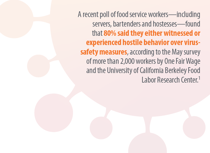
The inclusion of this data on the hostile behavior experienced by service industry workers over masking and other virus safety measures is the earliest evidence we have of the essentially honest intentions of the writers of the First Trust blog. The fact that hostile and belligerent behavior over masking and other safety measures is so widespread certainly paints a negative picture of those who are opposed to such policies, yet these will by and large be the same people that follow the COVID-19 information put out by the First Trust blog. It meets the criterion of embarrassment and speaks to at least their intention to take a balanced stance.
I realize that there is at least one other possible interpretation, but it’s so cynical- and so transparently flawed- that I wasn’t willing to lead with it. They could be saying, “look at how these masking and social distancing measures have resulted in violence and hostility towards people in the service industry! We need to end these mandates so that people don’t have to experience this hostility any more!“ If you find that argument compelling I’m not really sure what I can tell you. It seems blaringly self-evident that the responsibility for deciding to respond with hostility, intimidation, and violence towards employed individuals simply enforcing the policies of their state, city, or place of business rests solely with the person choosing to respond that way. Placing the blame on the policies themselves and absolving those doing the bullying of any culpability is obtuse in the extreme, and while I am sure some of their readers will take this data that way, I don’t really think it’s what First Trust meant in including this data.

I know people who are against masks and social distancing; I even know and love people who feel persecuted when they are asked to wear a mask (and tell me so, forgetting that I was wearing a surgical mask for hours a day to protect people against pathogens long before the COVID-19 pandemic). Those folks are wrong about masks being dangerous or ineffective, but I don’t for a minute think that they are out there in the world bullying waiters and cashiers over it. But the data shared in the First Trust COVID-19 Tracker shows that somebody is. So if you are one of those folks who are against masks and you happen to be reading this; here’s the take home message from this section of data; get your people. When you see this behavior occurring, don’t cheer it on or be a passive bystander, intervene. As an anti-masker yourself you may have a unique voice to de-escalate a situation where someone who shares your views is acting out towards somebody who is just doing their job.
New COVID-19 Cases and Daily Deaths
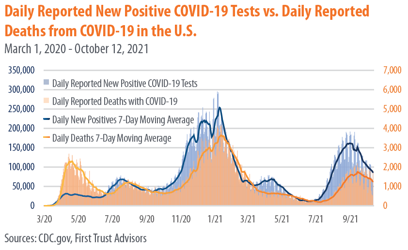
There’s nothing to criticize here, this data was clearly taken directly from the CDC and demonstrates that we are still very much in the middle of a deadly pandemic. Over 2000 Americans died yesterday from COVID-19, and we have now surpassed 728,000 deaths from the virus less than 2 years.
We are so used to seeing this graph, or something similar, that we have become numb to the enormity of this pandemic, and our tendency is to skip right over it and look for other data that either confirms or contradicts our position. But if there are still people out there claiming that the pandemic is exaggerated and that the virus is basically as deadly as the flu (and there are), then it’s worth pausing to look at this data.


Yesterday 2,011 deaths were recorded from COVID-19. The day before that it was 1,890. Each day in the US an average of 1,805 die of heart disease, and about 1,600 from cancer. The way that deaths are reported means that those 2,011 deaths represent people who died sometime in the preceding couple of weeks, and the people who will die tragically from this virus today will be represented in that data up to a few weeks from now; statistics can’t be reported instantaneously. So it’s most accurate to think of these as averages over time, and based on this we can see that more people are still dying from heart disease and cancer each day, on average, than from COVID-19. But it’s really, really close. And the fact that our healthcare system is stressed to the breaking point by the number of primarily unvaccinated people with severe COVID-19 symptoms means that both heart disease and cancer, and every other illness, are more dangerous now because patients are so much less likely to have access to the are that they need.
Again, we need to recognize that including this data is more evidence of the desire for fairness and balance on the part of First Trust. They didn’t have to include this, and many of the memes, blogs, and videos we have seen spreading misinformation over the past year have deliberately used outdated information and statistics from early in the pandemic, before it had spread significantly in most parts of the country, to ‘prove’ that COVID-19 isn’t dangerous. This data shows how dangerous it really is, and those who use the First Trust COVID-19 Tracker to prove otherwise need to take a closer look at their own resources.
Vaccines Administered by Type

Again, nothing controversial here; this matches the data I have. I’ll just add that the now 409,438,987 doses of COVID-19 vaccines given as of today represents 57.5% of the US population, which is encouraging. We should see that number skyrocket soon, once the vaccines are approved for children ages 5-11. My two oldest will be first in line, and my 3rd, who turns 5 this winter, will be right behind them.
Mask Usage vs. Daily Positive Tests

All good things must come to an end, and this is the point where the data presented in the First Trust COVID-19 Tracker begins to drift towards the highly suspect. Take a moment and look at this graph, and ask yourself whether the numbers you are seeing seem right to you.
Statistics are not always intuitive. The fact that meticulously collected and cautiously interpreted data transcends the limited observations we have to draw from in our own realms of experience is the reason they are so powerful. Sometimes our own circles or spheres of influences are outliers, and data from a wider selection of the population upends our expectations. Nevertheless, when a piece of data is so contrary to our experience that it actually seems impossible, we need to at least pause and consider the source, how it was collected, and what it means- good habits to get into with all data, to be perfectly honest.
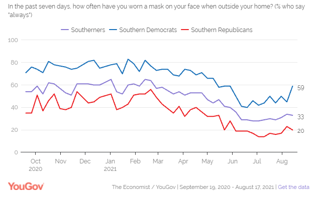
If you live in Texas (as I did until very recently), what might jump out at you from this data is the idea that up until May 70-80% of people were wearing masks indoors consistently when they left their homes. I’m not sure if you’ve been to the grocery store in Texas recently, but that number seems… High. Without a statewide mask mandate, I have frequently been inside of a place of business where I was the only person wearing a mask, and at best the numbers seem split about 50/50. Again, my personal experience might not be normative; we have to look at the data, which in this case comes from YouGov.com online poll data.
You may live in another part of the country (like, say, the suburbs of Chicago) and are saying to yourself, ‘no, that looks about right to me.’ And the reason is pretty simple; the USA is not anywhere close to a homogenous society, and health behaviors around COVID-19 are subject to dramatic regional differences, both due to and apart from varying State and local regulations.
Why does it matter? It would be easy for someone to look at the data from the Mask Usage vs. Daily Positive Tests graph from the First Trust COVID-19 Tracker and come to the conclusion that mask wearing is generally high in the US (close to 80% throughout the Winter) and that it makes very little difference in the ebb and flow of the pandemic. As you look towards the Summer of 2021 this illusion breaks down a bit; there is a definite drop in mask wearing prior to the Delta Variant surge beginning in mid-July. But because this data ignores the regional differences in mask wearing, it is telling a very one-dimensional version of the story; we also need to ask where the cases have been high, and where mask wearing has been prevalent. YouGov.com has some data that helps with this, even though the graph shown in the First Trust COVID-19 Tracker isn’t one of them. For instance, at the end of August, during the peak of the Delta Varint surge, only 33% of Southerners stated they consistently wore a mask. Yes, that feels much more like the Texas I know and love.
It’s a challenging question to study because demographics and climates vary, and surges are affected by not just state residents but also visitors and tourists and the people living in surrounding states. But there are studies that have done the work of comparing the rate of COVID-19 cases to adherence to masking at the state and local levels. The methodologies have been different, but each has shown what we already knew from comparisons between nations with varying mask policies early in the pandemic; in regions where mask adherence is high, COVID-19 cases are lower. And in regions that adopt mask mandates or similar policies, COVID-19 cases begin to fall.
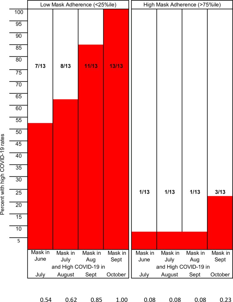
It’s impossible to fully tease out the effects of different behaviors that commonly occur together. People who are more likely to wear a mask at the grocery store are also more likely to eat outside whenever they can, to stay home from work when they feel ill, and to generally treat the pandemic with more caution in order to protect themselves and those around them. And though human beings are complex and nuanced in their actions and behavior, it’s still fair to say that in general those who do not believe in masking are also less likely to observe other mitigation measures as well. The question of percentage wearing a mask helps vs. what percentage coughing into your elbow or eating outside helps will probably never be answered with a high degree of precision; but they don’t really need to be. The point is that these efforts do prevent infection and death from COVID-19, especially when done together, and especially when used in conjunction with widespread vaccination.
Flu Vaccine Effectiveness

I’ll be honest, I have no idea why this graph is here. It is approaching flu season, so maybe First Trust wants you to see the importance of getting your flu shot? Or maybe they don’t want you to get your flu shot because it is never 100% effective? I don’t really know. If you want to read more about the differences between COVID-19 and Influenza, and why Influenza has been so unpredictable since the pandemic began, I have an article on that here: What Happened to the Flu? (Hint: It’s not because doctors are ‘changing flu cases to COVID’).
Duration of Immunity from COVID-19 Vaccines
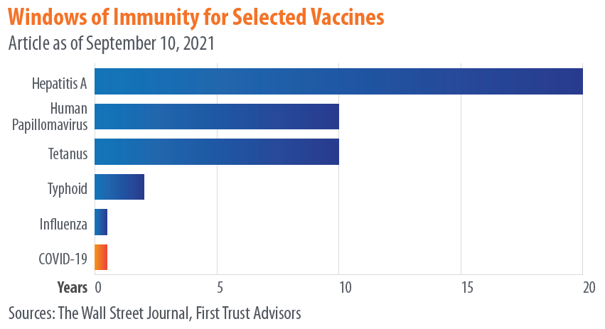
We saw earlier how the comparison between mask wearing and COVID-19 cases juxtaposed data in a way that obscured rather than elucidated the relationship between masking and prevention of COVID. It told a false narrative, sure, but using real and related data, just data that was too generic to actually draw conclusions from. This is the first example of what I would really call misinformation, and it falls under the category of comparing apples to oranges.
While I applaud First Trust for listing their sources, the problem is that their manner of referencing doesn’t actually allow to get back to primary data. They list their source for this data as “The Wall Street Journal,” without listing a specific article. When you find the article on the Wall Street Journal, they just have the same exact chart up but instead list their source as “The CDC,” again without linking to any specific publication, announcement, article, or study. Why not just list “The Internet” for your source and call it a day guys?
What this graph seems to be showing is not how long you are immune against various infections following vaccination, but how long you have detectable antibodies after vaccination. Calling these “windows of immunity” is highly problematic and misleading (whether it’s being done by the Wall Street Journal or the CDC), because- and I cannot stress this enough- presence or absence of antibodies is not the same thing as immunity.
So much has been written explaining this; here is an article, and another, and another, and another. Antibodies are one of the main, active end-products of your immune response to both infection and to vaccination, but they are proteins, and they do not live forever. Most antibodies will die between 3-6 months after they are created, and then they have to be replaced by newly produced antibodies. If you have been exposed to a virus, either through vaccination or infection, and are then exposed to it later, your ability to mount a robust, effective immune response does not depend on the present of antibodies, but on your ability to make antibodies.

This is determined by a variety of immune cells that your body makes in response to the presence of a pathogen, including plasma cells. An essential strategy that your body uses to fight illness is that it can remember what infections you have already fought off in the past; it doesn’t have to keep circulating antibodies to every disease, but it does keep long-lived cells that can produce a rapid and robust immune response- including the rapid production of massive amounts of antibodies- if you are exposed again in the future. Showing a chart of how long antibodies last has absolutely no bearing on whether or not the vaccines that produced those antibodies will protect you for years to come. Thankfully, the studies that have been done so far give us compelling reasons to believe they will.

COVID-19 Death Rate in Seattle vs. The UK

Let’s leave aside for the moment the question, which this chart seems to beg, of why someone in Texas is confronting my friend with a publication from Chicago comparing COVID-19 statistics between The UK and Seattle. There may be a very rational explanation, I just have no idea what it is. Why did they choose these locations? And why is it more compelling to this person than data from their own state?
I think there are two impressions that someone might walk away from this chart with (though I would like to add a third).
First, one might compare these side-by-side graphs where the death rate seems to be about 100 times high in the UK, and determine that for whatever reason our risk of death from COVID-19 in America (or at least Seattle) is far lower than in other countries (or at least the UK). The problem with this is pretty clear, and I’m surprised it wasn’t caught before First Trust published this infographic: the graph from the UK shows total death rate per 100,000 people for a selected time period (the UK is currently experiencing a sustained surge of the virus), while the Seattle graph shows the death rate per 100,000 people per day. And that daily rate is an average of 9 months, including months where cases were very low and months where the Delta Variant was causing a significant surge. If you want to get the total death rate for the Seattle graph for that entire time period, you would need to multiply the daily rate by 261, the number of days from January 27th to September 29th.
This would give you numbers like a death rate of 80.91 out of every 100,000 for unvaccinated people ages 50-64, and 467.19 out of every 100,00 for unvaccinated people aged 65+. This is still comparing apples to oranges with the UK numbers (9 months with and without surge vs. 1 month of sustained surge), but it seems like maybe the point is to just make the numbers look small, regardless of what they actually mean. “Hey,” you might think, “it’s less than 0.5 for people my age! That’s not bad!” Except that 0.5/100,000 risk of dying from COVID-19 is every single day and includes the days where there very few COVID cases. It’s important to know what this data means before you use it to inform your decisions about the pandemic.
The 2nd impression you might walk away with is that the virus is very dangerous for people in their 50’s, 60’s, or older, somewhat dangerous for people in their 30’s and 40’s, and not as dangerous for children, teenagers, and young adults. This is absolutely true; age is a huge risk factor. But one of the effects of choosing a daily death rate is that you can get the numbers on the graph as close to zero as possible, to leave someone with the impression that practically nobody has died from COVID-19 which isn’t the case.

When one child dies we call it a tragedy, and it affects the course of their family’s life forever. As a father of four, I can’t imagine what it would be like to lose one of my children. The COVID-19 pandemic has killed 513 children in the US. When a young person dies we call it a tragedy, and their parents, loved ones, and friends are left devastated. The COVID-19 pandemic has killed 3,888 young people. Those 712,930 people who we have lost to the virus all represented lives cut short; live full of purpose, filled with people who loved them. Yes, a disproportionate number of those who have died were elderly, and a disproportionate number of the younger people died had chronic illnesses or disabilities. If you’re here to make the argument that their lives were somehow less valuable, that they were less deserving of a society’s efforts to protect them from the virus, or that it was somehow less of a tragedy that they died from it, you can exit my blog right now and go read something else.
Finally, the third impression you could take from this data (and again, props to First Trust for not trying to alter this data in any way), is just how effective the COVID-19 vaccines really are. Whether you are looking at the Seattle data or the UK data, there is a hug difference in the height of those orange ‘not fully vaccinated’ bars and those blue ‘vaccinated’ bars. I’m still not sure why they chose King County Washington, but here’s some additional data from the same county COVID dashboard that produced these graphs.

If you can take one salient, actionable piece of wisdom from the First Trust COVID-19 Tracker, it would be this: the COVID-19 vaccines work. You should go get vaccinated.
